(A shortened version of this post was published earlier here.)
A little less than two years ago I started writing my first fantasy novel. It has since grown into a series (The Hounds of Annwn) with four novels, five short stories, and a story collection, and I’m not done with it yet. I found a prolific Russian surrealist artist on the stockphoto sites whose work I admired, and I’ve used her images for all the covers (I have a minor level of competence in Photoshop, enough to design layout, fonts, and framing.) You can see those covers here.
I’m starting a new fantasy series now (The Affinities of Magic) and I know I’m not going to find a similar artist for the covers off the stockphoto sites, so this time I decided to commission cover art. It’s been a fun learning experience, and I couldn’t be happier with the results.
Starting up the learning curve
Like everyone, I started by asking for recommendations, and I sure got a lot of them. Unfortunately, almost none of them were in my genre (Fantasy), and there’s little that an excellent artist who specializes in photorealistic Romance shots can do to help me.
GENRE is the first and most important consideration. The purpose of a good cover is to (1) help the reader understand at a glance what genre the book is in, and (2) make the reader want to find out more (that’s where “quality” comes into play).

You need to know what the rules of covers for your genre are, so that you can signal appropriately to your potential readers. First step? Look at what other books in your genre look like. (See the above picture of a bunch of Fantasy books from Amazon – I added one of my older books as a comparison for legibility of Authorname. Click on this image or any other to see a bigger version.)
Fantasy as a genre tends toward illustrated covers instead of photo montage, though the ubiquity of stock photos is causing more photo-based covers to be created. One way to scream “Fantasy” is to use an illustration.
Pre-made covers and stock photo sites are therefore not good places to look for this genre, though suitable for others. I wanted an illustrator, and I was going to have to go it alone, learning as I went along. And I had a budget to consider…
Who does what
One fundamental question you need to answer is: how much responsibility do you want? Some people want to spell out a rough concept and leave the whole assembling of the final cover to a competent partner, restricting themselves to choices and comments. Others want to do the whole thing themselves.
Personally, I would rather come up to speed on all the requirements I can do for myself, to maintain as much independence as possible, and let the artist specialize in the things I can’t do. I see it as a choice between intimate collaboration with a partner vs a hand-off.
I knew from the start that I would take responsibility for the design/placement of the Authorname (cover & spine), the imprint (spine), all back cover text, and the bar code. My cover artist could just use placeholders for that.
I especially own the branding requirements. I want the Authorname to be consistent across all of my books for all Genres. I want the covers for an individual Series to look related. And I want the Genre to be clear. Authorname was already established for the first series, so I knew the font, size, and placement (I’ll allow the color to vary). Genre required a clear “Fantasy” signal. That left “Series” (see below).
Refining the scope
When I think of book covers, I consider the whole series requirement, not just the first book. (The new series will have several books and a few shorter works.) This allows me to consider the entire budget and use economies of scale, and it gives me an opportunity to re-use many elements.
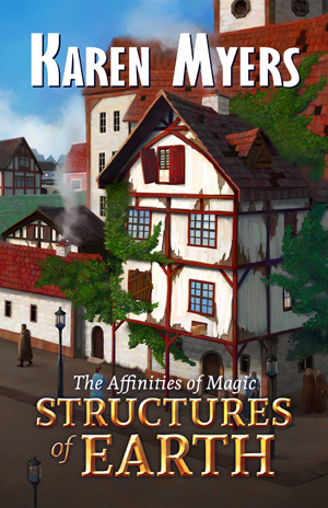
In this particular case, the story involves the resurrection from ruin of a wizard guild house and its conversion to a magical academy, a process that will cover several novels. There is a main character (of course) but rather than depict him, I decided the incipient academy itself would make a better choice, almost as if it were a character itself. It would be both interesting and rather easy to depict its physical changes over time, book after book, and the image would be both clear and recognizable for each new entry in the series. That would also make each subsequent cover’s cost much less than for the first one, because only some elements of the cover would need to be repainted rather than the entire scene.
Short works would also need covers but I didn’t want to spend as much on them. Each story and novel includes a subplot element of an animal or plant being investigated for magical potential, and I decided to manifest that as a little vignette. For long works, that vignette would go on the back cover, but for short works (which don’t need a back cover, being too short to print), that back cover would become the front cover, with the vignette in place. This allowed an easy visual cue for the reader to distinguish between long and short works, while clearly basing them both in the same series.
I didn’t come up with this concept all at once but in the course of a couple of conversations with my potential (and actual) cover artist. The result was cost components for the entire series:
- a) Initial wraparound background and layout for long works
- b) Updated limited painting (improved academy) for each new long work
- c) Each vignette (on back cover of long work, or on front cover of short work)
The result is a series of reasonable and predictable prices that allow for maximum reusability.
To re-use material like this requires a design partner who understands the purpose. I understand layout requirements for the end product and thumbnail visibility issues, but I can’t draw or create images to those requirements. I was able to advise the artist about the areas I specialized in and he was able to concentrate on his specialty – actual images. It made for an excellent division of labor.
Note: since I was using a wraparound cover and would continue to use it over the life of the series, I had to remember that I could not predict exact spine width for each book (page count) and made sure we accounted for that when we talked about overall size by using a maximum spine width in the design.
Asking for submissions
I started by going straight to Deviant Art where I found tons of great artists whom I thought might work. I contacted over a dozen of them, and only one replied (discouragingly). Others have reported similar issues with Deviant Art, though your mileage may vary. Deciding I wanted to talk to people who were at least looking for work instead, I switched to eLance and had much better success. Of the many who replied to my posting, I singled out two individuals and one commercial art firm for auditions.
The commercial firm was slow to respond, and expensive, and ultimately never submitted an audition, but both the individuals did, and their prices were quite reasonable.


I could have worked with either vision, but the two-pager more clearly captured the essence of Fantasy that I had in mind, and more clearly made the decrepit building a “character” instead of a background. The single-pager had more of the vibe of Steampunk, or perhaps a Victorian novel. Signaling “Fantasy” was overwhelmingly important to me.
Moving from audition to final product
The key thing in working to the final version is to do it as a series of iterations. Try never to waste your artist’s efforts by moving backwards (changing your mind).
Pay attention the first time you send a series of corrections and suggestions back. The artist should react professionally, not defensively.
I gave as much guidance as I could for the initial design, with crude diagrams (I can’t draw) and schematic layouts to help (his initial vision showed only the servants’ quarters so I had to show the layout of the compound to communicate what parts of the immense guild house should be visible behind it).


Take advantage of accidents, too. The artist included a straight line in the background that hinted (to me) at a river and I asked him to make that real. He hinted at an alley and we made that real. I removed logical inconsistencies in his iterations (window treatments, architecture, vines).
I also sent him style hints. For example, I suggested this fantasy city could be European, Oriental, or something wholly new and alien – colorful, exotic, whatever. Both my young artists were British and apparently “fantasy” to them meant European, so I sent strong hints about colorful buildings with lots of links to Baroque eastern European town centers. The more images you can include that provide any guidance, the better.
The most challenging thing was handling thumbnail legibility. My artist had designed book covers before but had never really focused on the thumbnail issue, so I made sure to take charge of that. I kept moving him toward brighter and more colorful until it matched or exceeded other thumbnails in the genre. That’s where readers will shop for you, and it’s important to both stand out and look in-genre.

Special touches
Don’t forget you can reap other goodies from your artist (mention these up front). In my case, I decided I could include a grayscale version of the vignette inside each work. (Cuz why not?)


I also asked for a sigil of the wizard’s guild to use as a series symbol on the title page (Torch & Scroll) and fleurons I could shrink to use as section dividers, chapter ends, and book end markers.

Maintain good relations with your partner
I like to get my covers done early in the process, when I’m just starting to write, not at the end when the work is done. That allowed me to have a two-way collaboration with the artist, where his iterations helped me drive the setting of the story. I didn’t know it would be set in a river port before we updated the cover iteration, for example, or just what would be in that compound before I had to finalize it to give him guidance. I sent him Chapter 1 so he could see how his work influenced the story and promised him a copy of each book as it came out.
I made sure I knew how he wanted his name and link on the copyright page and offered to provide references.
When we finished the cover for the first book, I checked to make sure he was still comfortable with the pricing for the rest of the series, now that he knew better what it would be like.
You can see more of Jake Bullock’s work here.
For more about this case study, see here.


Hey, Karen, I saw your link on TPG’s site, and thought I’d come take a look at your process. You’ve given me some good ideas on how to go about creating a theme for my series, so thank you!
Glad you found it useful!
Sorry for the delay in approving the comment — for some reason the notification ended up in my spam bucket.