This article is crossposted to Jaye Manus's website.
Silly me. I’m an old programmer and I pride myself on trying to get my ebooks “just so”, as if I were writing a piece of code. I want to create worthy offerings to add to humanity’s river of books; at the very least, they should be shiny and well-scrubbed.
So when Jaye Manus offered to judge the formatting of a few books from her blog fans, I hopped right on board, and she was very kind in her review. But I read with horror things like “squishy line spacing” and links to chapters not working quite as they should, systematically.
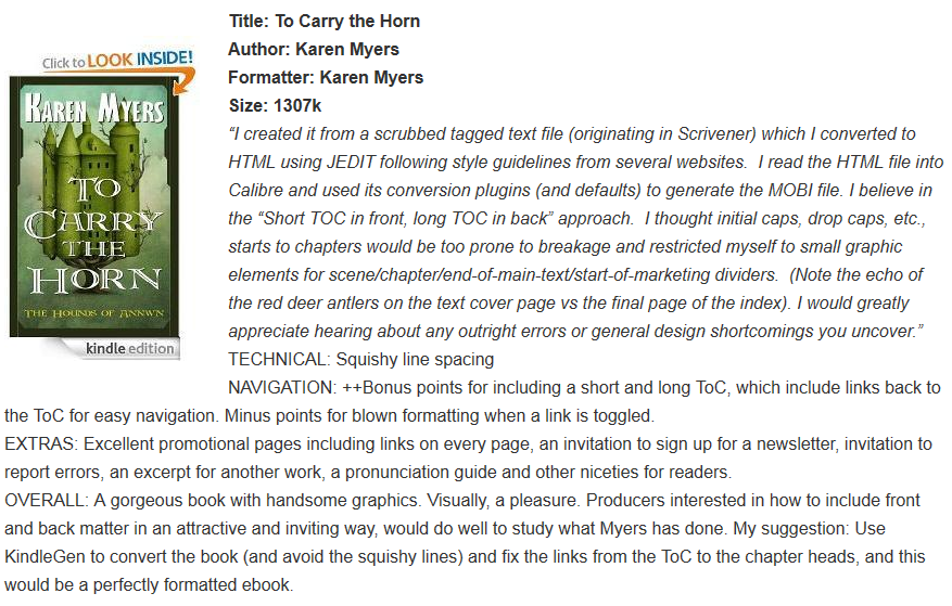
I use an EPUB reader and hadn’t seen the book on a Kindle device other than the PC Previewer, so it was useful to see this from the Kindle reader’s perspective, since none of my buyers had complained (yet). Without a Kindle device, I hadn’t realized quite how irritating it was to not properly trigger the “Cover” and “TOC” hard buttons.
Now on the one hand, it wasn’t really broken, but on the other hand, I want perfection in book formatting, and some cosmetic and graphic flourishes. I’m not willing to settle for “good enough”, so Jaye was nice enough to coach me through some of the issues.
If you’re content with auto-conversion from EPUB to MOBI or vice versa, or output direct to ebook formats from products like Scrivener, then this is overkill for you and you can stop reading now. But if you want as much control as possible over the results without killing yourself, you might find the following approach useful.


